
In this guide we’ll be taking a closer look at the Reporting section of your recruiter account. We’ve designed the reports in this area to help you gain a better understanding of your jobs’ performance, providing you with insights that can help you take proactive steps to improve your response whilst your jobs are live.
Time frame selector
The first place to look in your Reporting area is the time frame selector at the very top right. Any reports that appear on this page are determined by the dates you select here, whether this be the last few days or looking back over months of historic data. You can select from the preset time frames or set your own custom date range.
In addition, once you’ve run a report for your chosen dates, you can download the report here in either PDF, CSV or Excel format via the Download button.

Pipeline summary
The very top of your Reporting area displays your recruitment pipeline. This shows you how many applicants your jobs received during your selected time frame, as well as how many applicants were moved to each stage of your pipeline during this time (screening, interview, hired and rejected).
This allows you to keep track of how many applicants are successfully progressing through to the latter stages of your recruitment process, helping you gain a better understanding of how well your jobs are attracting relevant, qualified candidates. It can also allow you to spot if there are any stages of the process that are experiencing problems that may need addressing.

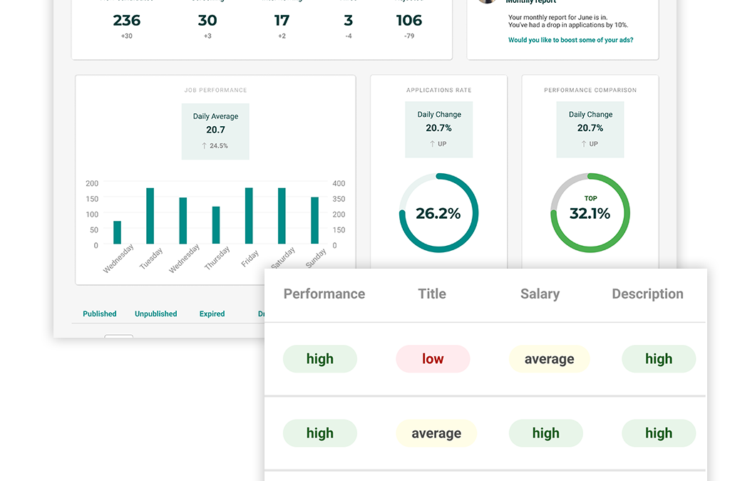
Applications
This table sits just underneath your recruitment pipeline, and is designed to give you a snapshot of when the busiest periods have been during your selected time frame, in terms of how many applications you’ve received. Depending on the time frame you’ve selected, this graph will show your applications either day-by-day, week-by-week or month-by-month.
For example, if you look back over the last 7 days, the graph will show your applications for each day. If you choose to look back over the last 30 days, with this being a larger time frame, the graph will display your applications on a week-by-week level. And if you choose to look back over the past 12 months, the graph will display your applications on a month-by-month level.
We recommend keeping an eye on this graph and taking regular looks back over your recent performance across a variety of time periods, as this can help you build up a picture of when the most popular times of the week, month and year are for your jobs.
This can help you make more informed decisions on when to post your jobs in order to gain the most applications, and can give you a deeper level of context as to the potential seasonal trends affecting your jobs’ performance.
Application rate
To the right of your applications table, this section tracks the rate at which the views on your jobs are converting into applications; for example, if your jobs had received 100 views during your selected period, and 25 applications had come from these 100 views, your application rate would be 25%.
This section also provides you with a percentage change compared to the previous period; for example, if you’ve chosen to look back over the last 7 days, this percentage change will show how your current application rate has increased or decreased compared to the previous 7 days.
This can help you monitor your performance trends more closely, allowing you to take action if you see any sharp drops in your application rate.

Performance comparison
To the right of the application rate section you’ll find your performance comparison. This acts as a benchmark for you to compare your jobs’ performance with other similar roles on the site, giving you more context as to how your jobs are performing in relation to other recruiters in the industry.

This section is based on your application rate, and provides you with a percentile to give you an idea of whether the views on your jobs are converting into applications at a similar rate to other jobs on the site.
This is designed to give you the peace of mind in knowing that even throughout various fluctuations in performance, other recruiters may be experiencing the same due to wider seasonal or industry trends.
On the other hand, if you can see your jobs are consistently converting significantly below the average, it can help prompt you to investigate why this may be and address any potential issues with your adverts.
Jobs table
At the bottom of your reporting area you’ll find the jobs table; this allows you to get into extra close detail regarding your jobs’ conversion, and spot what could be contributing to any performance issues you may have spotted. We’ll go into more detail on how to get the most out of the information in this table in the next guide, so keep an eye out for this.

How to make more informed recruitment decisions using candidate profiles
In this guide, we’ll be taking you through one of the most significant new features of our new and improved site: the candidate profile. Why we introduced candidate profiles The candidate profile is an alternative to the traditional CV where legal...
Top time-saving tips when using CV Discovery
In our latest guide to the new and updated features of your recruiter account, we’ll be taking a look at CV Discovery and providing some tips on how to save time during your search. Recent Searches When you access CV Discovery, you’ll see the search bar...
How to save yourself headhunting time with the Talent Pool
In our latest guide, we’ll be introducing you to the Talent Pool, which is a brand-new feature for our recruiters; we’ll also demonstrate how using this can save you time and effort within your recruitment process. Saving candidates to your Talent Pool The...