In the latest in our series of guides showing you around your new and improved Recruiter dashboard, we’ll be demonstrating how you can use your dashboard to spot key trends in your jobs’ performance.
Recent Report
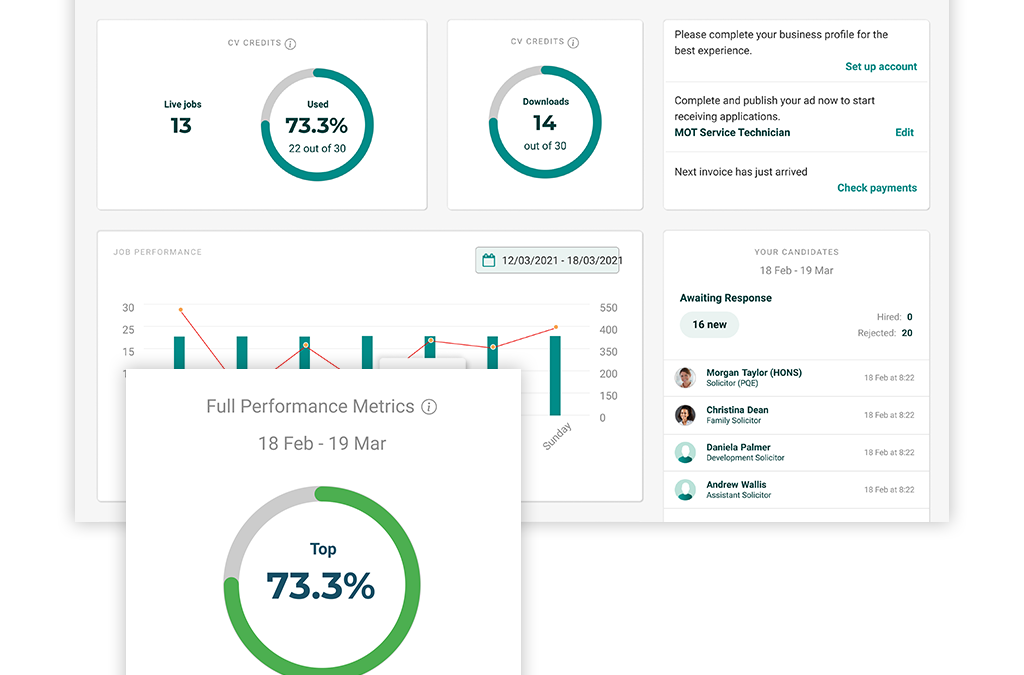
The Recent Report graph is visible just below your current job and/or CV credits on the left of your dashboard, and gives you a snapshot of your jobs’ recent performance.
The green bars on the graph indicate the total number times your jobs have been viewed, and the red line indicates the total number of applications your jobs have received. See the left hand side of the graph for more context on the actual number of views, and the right hand side of the graph for the actual number of applications.
For example, monitoring which days of the week your jobs tend to perform well on can help inform when may be best to post future adverts. Or, if you have made any recent changes to your adverts, this section can help you spot whether these changes have had a positive impact on your applications.
Job Performance
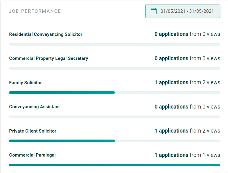
Underneath the Recent Report you’ll see the Job Performance area. This section gives you a breakdown of your views and applications on a job-by-job basis, giving you a closer look at where exactly your applications are going.
The green bar underneath each job is designed to give an indication of how well each job is converting views into applications, helping you spot any potential issues which may be hindering certain jobs’ performance – and highlighting which jobs are your best performers. These insights can help you make decisions about your adverts in order to replicate what has worked well before.
Again, use the date selector at the top here to change the time frame you want to look back at. Any jobs that were live during your selected time period will be displayed in this report, so don’t worry if you want to check on a job which is no longer live; as long as it was live during your selected timeframe, you’ll be able to look back on its performance.

Performance Comparison
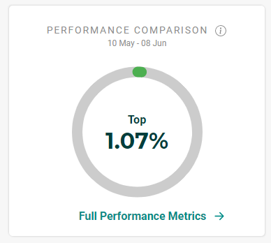
The Performance Comparison area to the bottom right of your dashboard gives you a benchmark as to how your jobs are performing in comparison to other recruiters on our site, giving you some wider context and reassurance as to how your jobs’ recent performance falls in line with industry trends.

Clicking on “Full Performance Metrics” here will take you into your Reporting area, which is where you can take an even closer look at the factors influencing your jobs’ performance. We will provide a full guide to the Reporting area in an upcoming article, so keep an eye out for this!
5 ways your job posting experience just got easier
In this guide we’ll take a closer look at some of the recent updates to Simply Law which have been designed to make your life easier when posting new vacancies; many of these have been implemented thanks to direct feedback from our recruiters. It’s our goal to make...
Discover the factors affecting your jobs’ performance with the Reporting area
In this guide we’ll be taking a closer look at the job performance table, which you can find at the very bottom of your Reporting area.This table gives you the most in-depth insights out of all the reports on your account, providing you with a super-detailed look at...
Tracking your jobs’ performance: how to turn insights into actions
In this guide we’ll be taking a closer look at the Reporting section of your recruiter account. We’ve designed the reports in this area to help you gain a better understanding of your jobs’ performance, providing you with insights that can help you take proactive...


